In March 2022 I was invited to Oslo to redesign the current app. The customers called support really often and it was obvious that a fresh person should review and improve the current app. I was glad to meet the team and enhance user experience.
Requests and challenges:
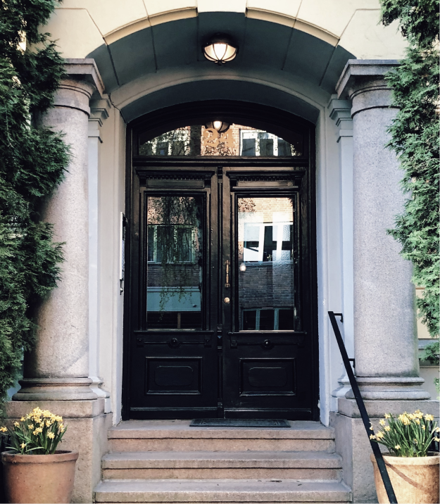
Some users complained that it was hard to find the right door
By mistake they change the visibility of the door
Users didn’t understand how to change visibility of the door and called support
People had issues with calling settings and contacted support (again)
«We want it to look Scandinavian since we a Scandinavian IoT provider»
Create a super simple interface for elderly with limited functionality.
Role
Lead solo designer
Niche
Reesign of access controling system
Location
In house, Oslo; Norwegian and USA market
When
March 2022 - June 2022
In March 2022 I was invited to Oslo to redesign the current app. The customers called support really often and it was obvious that a fresh person should review and improve the current app. I was glad to meet the team and enhance user experience.
Requests and challenges:
Some users complained that it was hard to find the right door
By mistake they change the visibility of the door
Users didn’t understand how to change visibility of the door and called support
People had issues with calling settings and contacted support (again)
«We want it to look Scandinavian since we a Scandinavian IoT provider»
Create a super simple interface for elderly with limited functionality.
Click to learn details ↓
Collapse ↑
Role
Lead solo designer
Niche
Reesign of access controling system
Location
In house, Oslo; Norwegian and USA market
When
March 2022 - June 2022
Overview
- Conducted research through stakeholder interviews, data analysis from the support team, and onsite observations to identify user needs and challenges.
- Developed and tested a new user flow and visual style using interactive prototypes in real-life settings. This included designing an intercom for a nursing home in Oslo, where user testing and observation were conducted in collaboration with researchers from academia, focusing on accessibility for aging individuals.
- Worked closely with team members and adhered to accessibility standards, specifically catering to the unique needs of aging individuals.
Problem
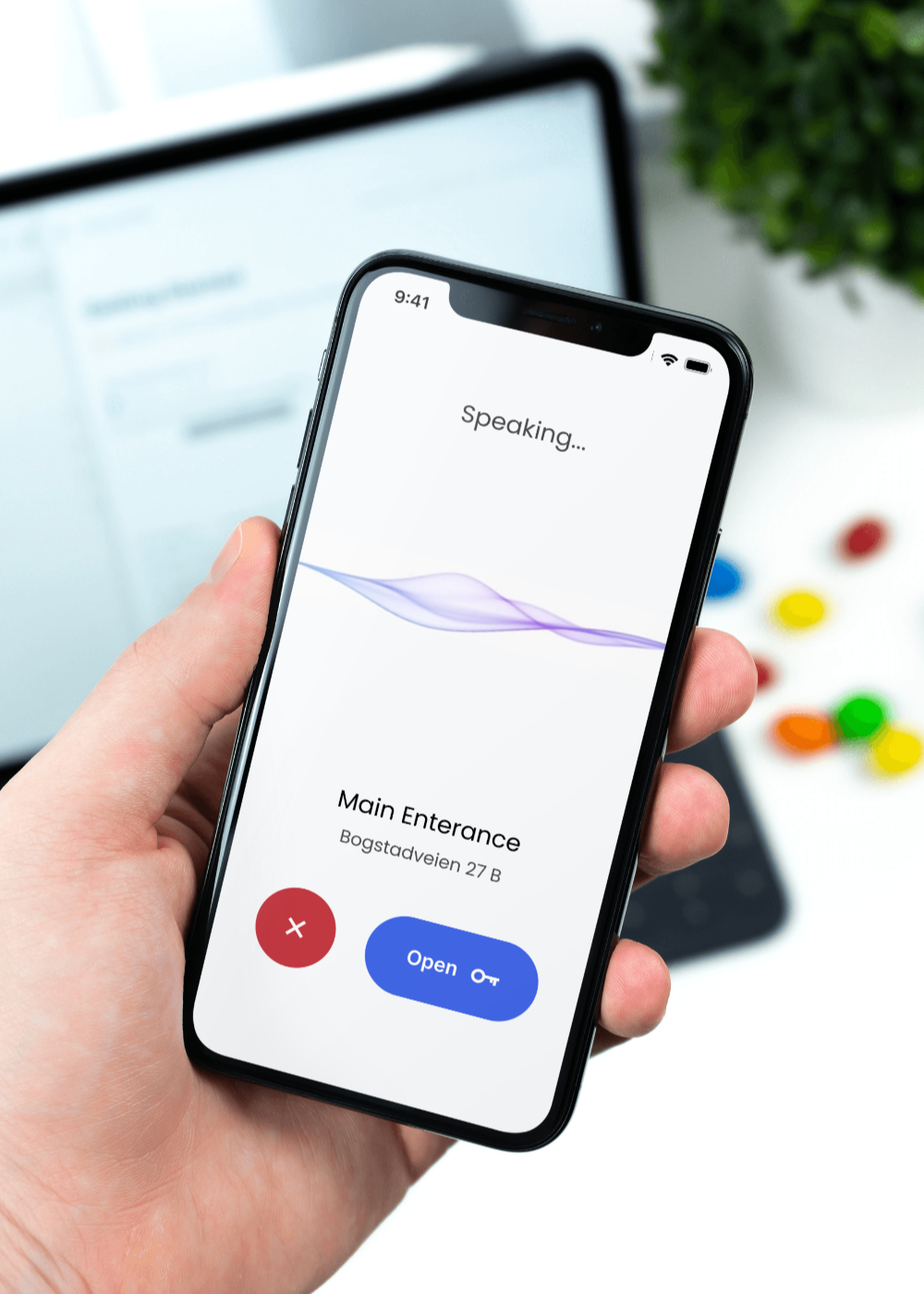
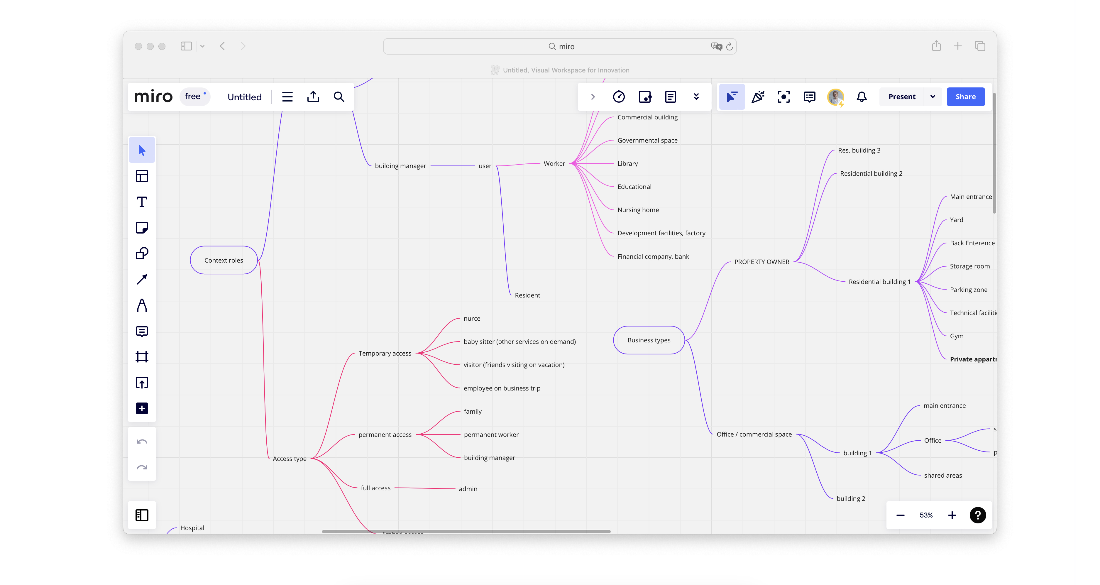
The challenge was that different types of users may have different doors for access. In addition, some of the doors may be used more often, while others could be open just a couple of times during the year.
The mind map shows the complex structure and contexts the system was used.
Adjust to different user needs
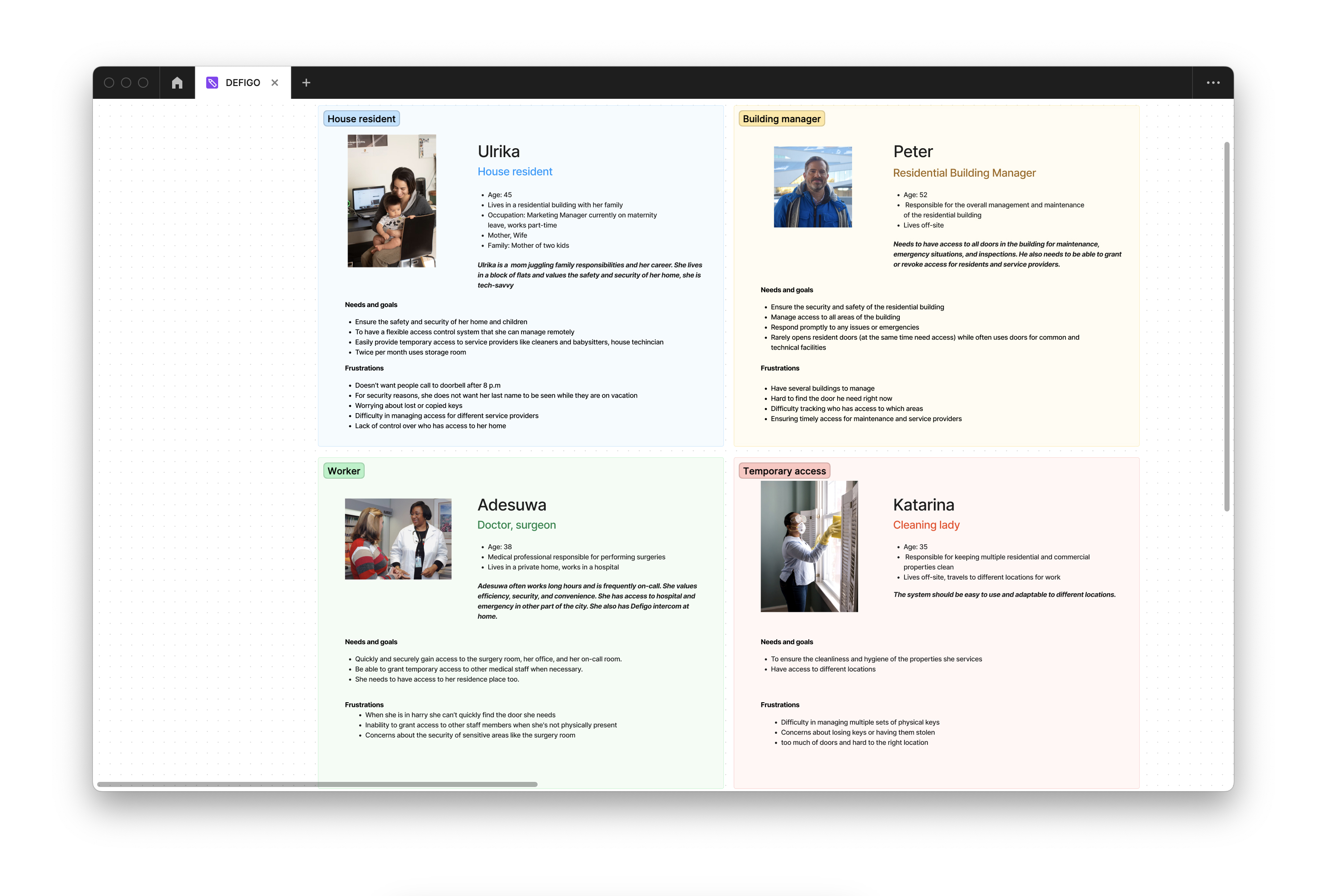
The challenge was in different user types, their roles and their priorities while using the system.Talking with Charlotte, the support lead of Defigo, we revealed that the common problem was to help people find the door they need and have quick access.
Personas
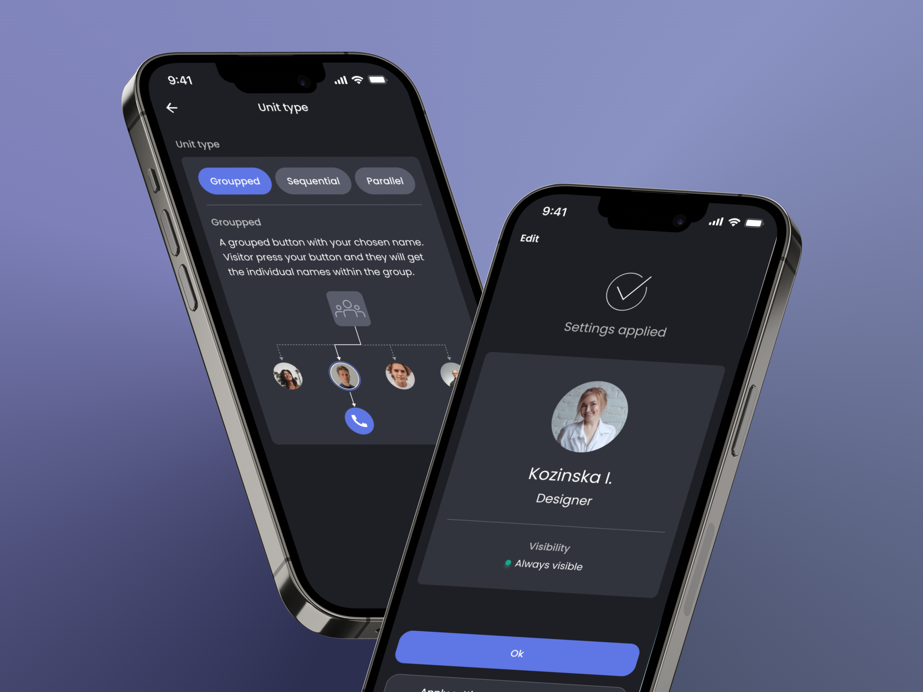
From first glance it seemed to be a good idea to design apps differently for different roles. However, it would require additional money and time for development.
How to make the system accessible for all user types and flexible in development?
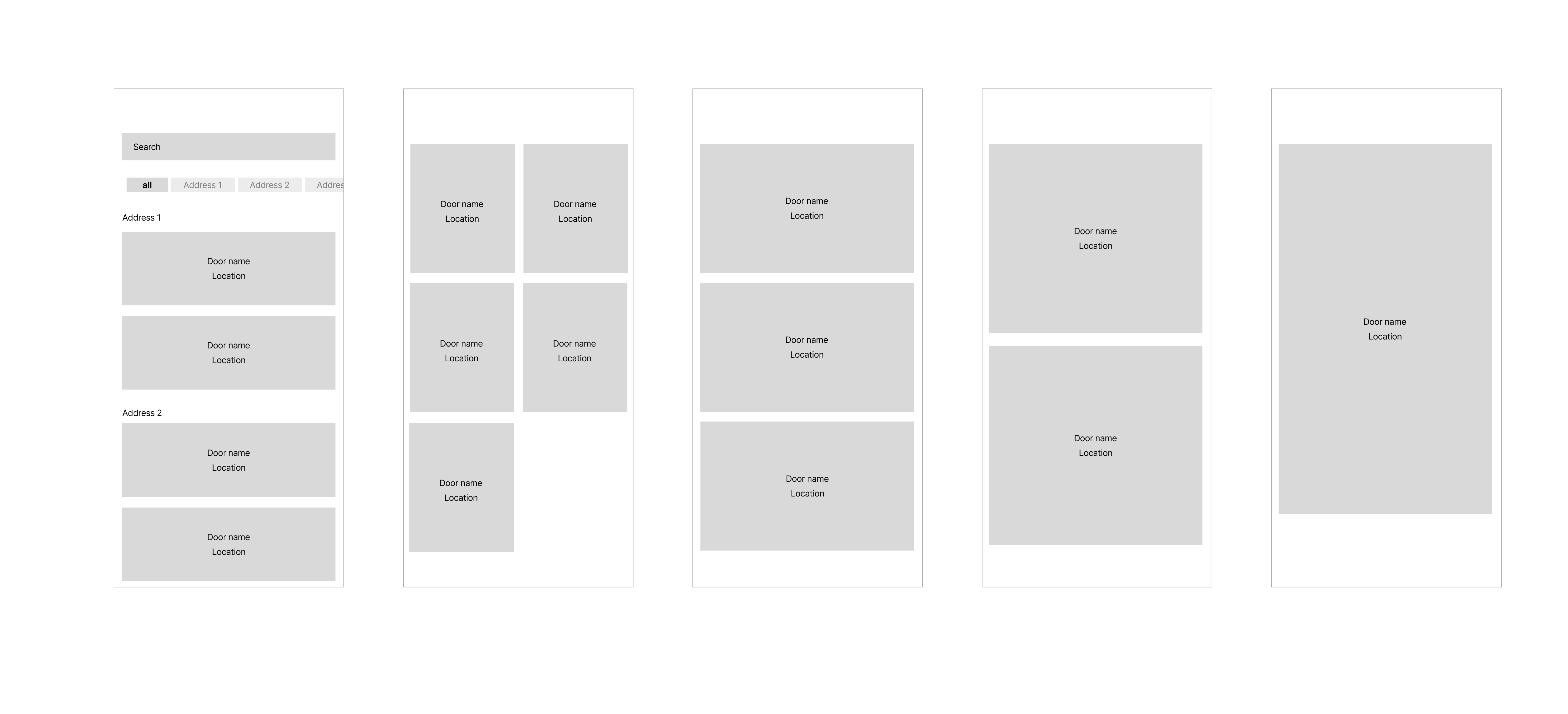
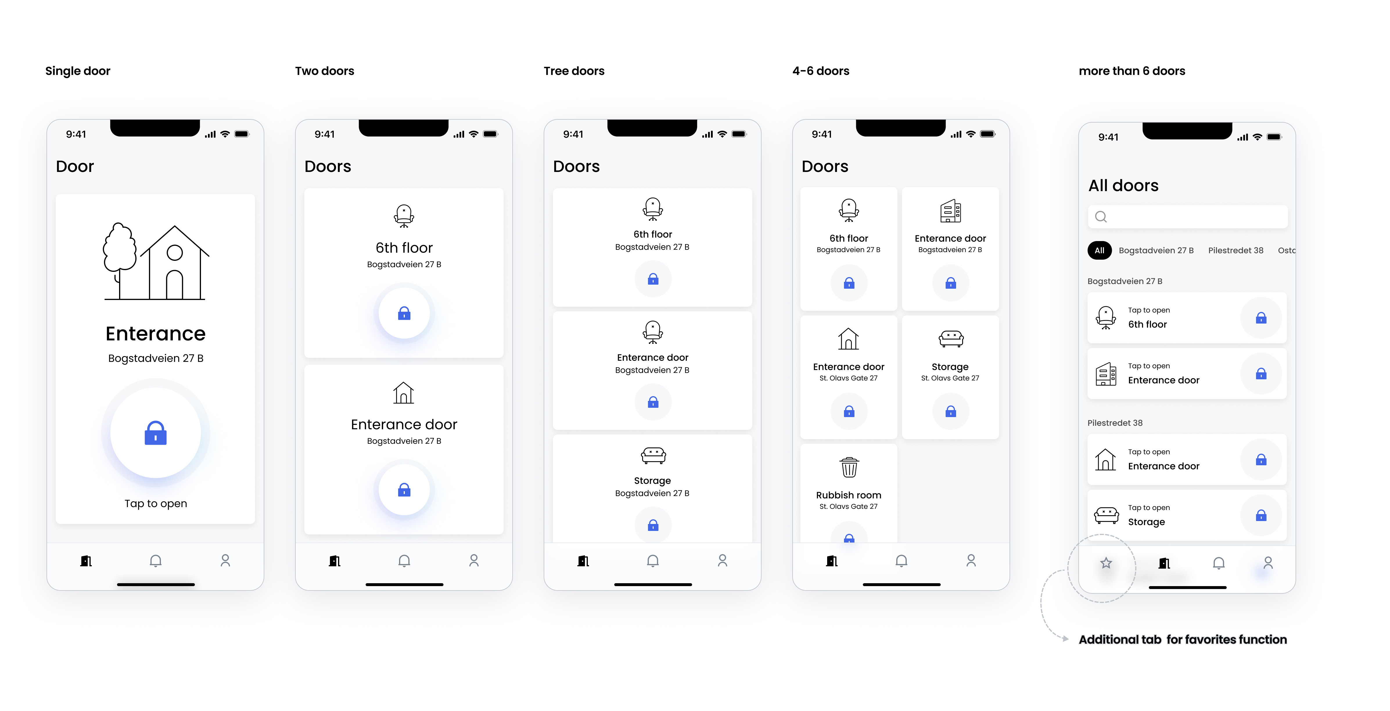
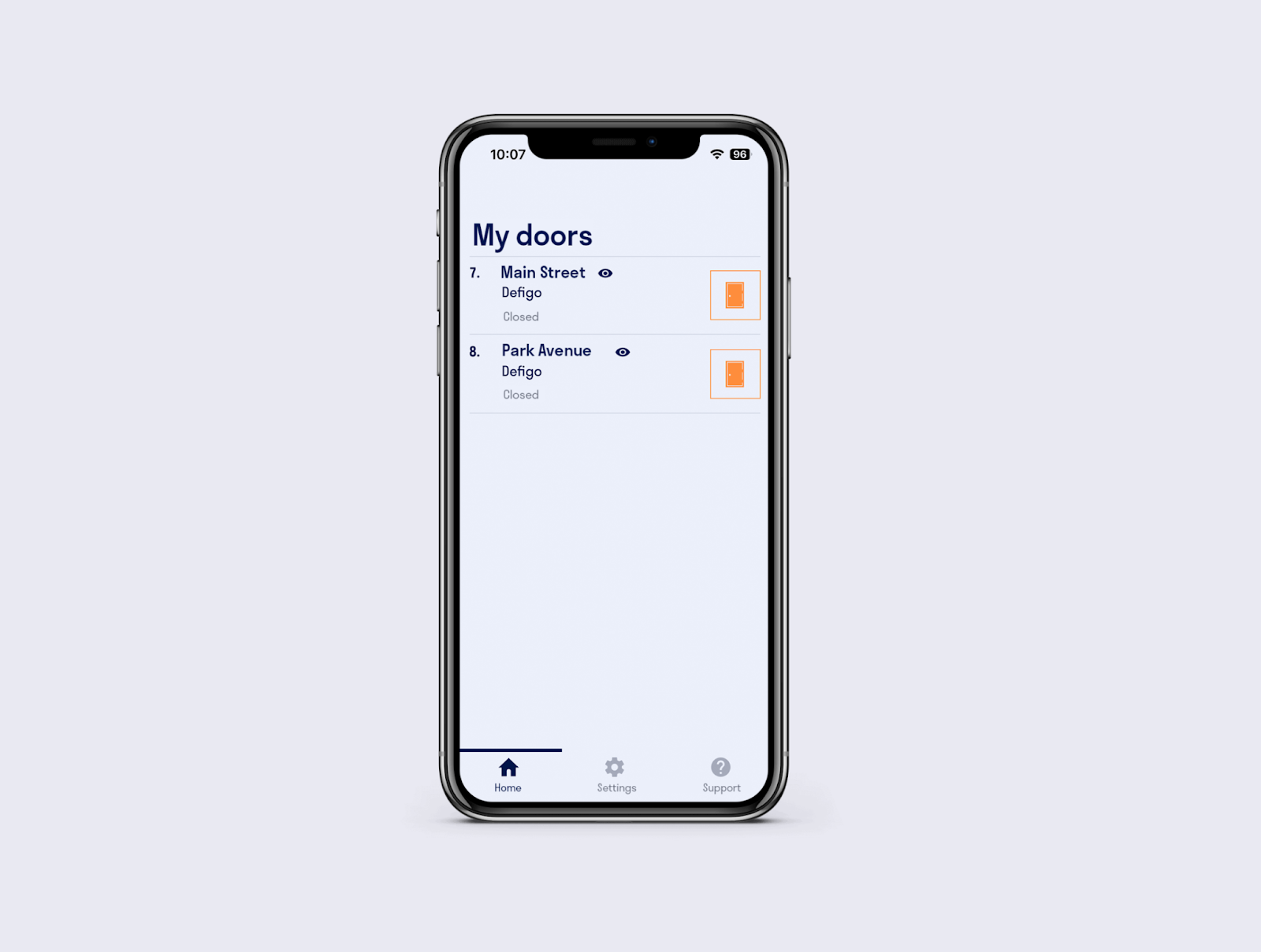
I suggested the solution, where the layout adjusts to the number of doors.
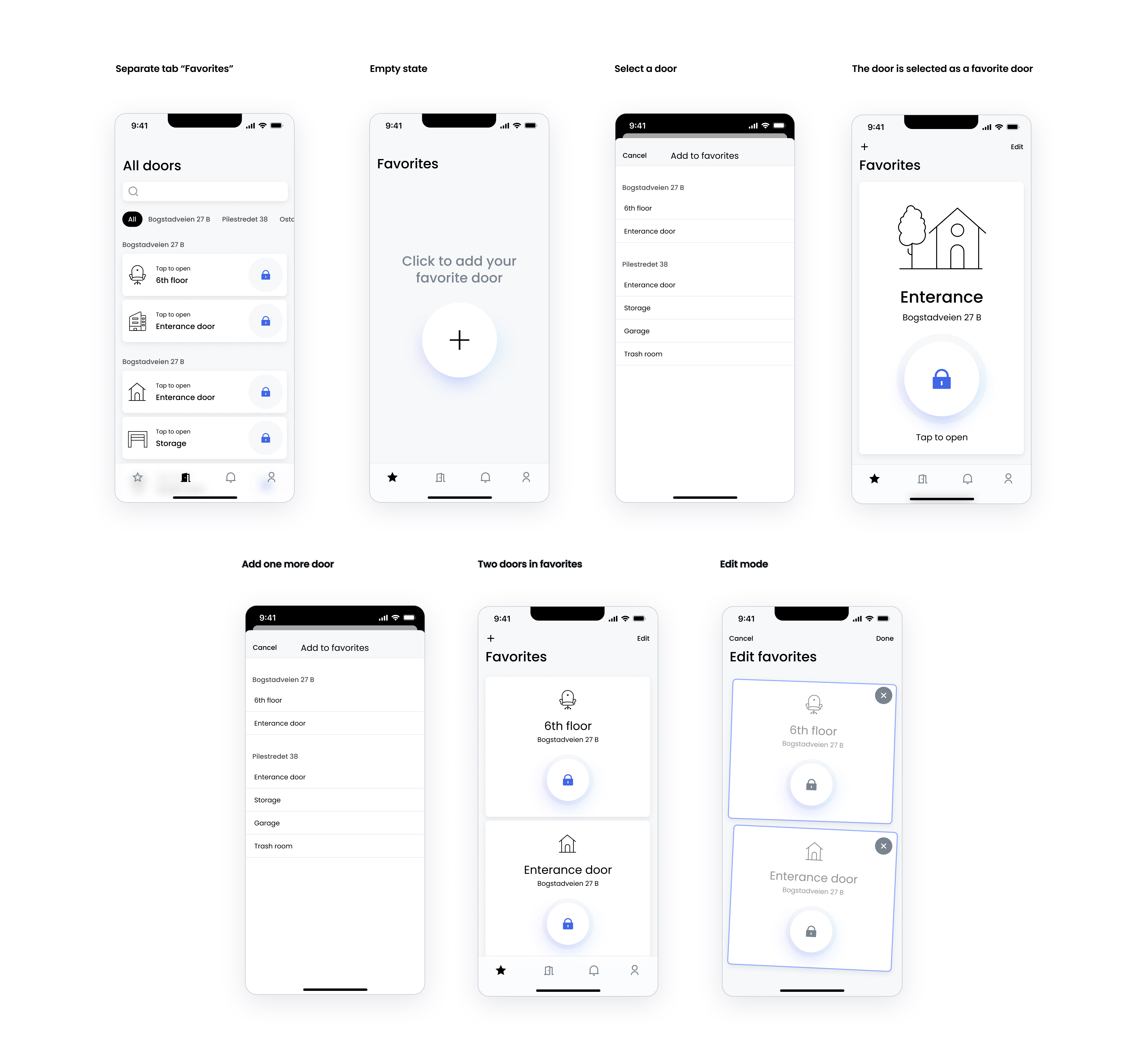
Up to 6 doors can be placed on one screen, so there is no need to scroll.
If a user has access to more than six doors, a new 'Favorites' tab appears in the bottom navigation, and the display switches to list view. In this view, doors are sorted by buildings and include a search option. The 'Favorites' tab now becomes the main tab, providing quick access for the user.
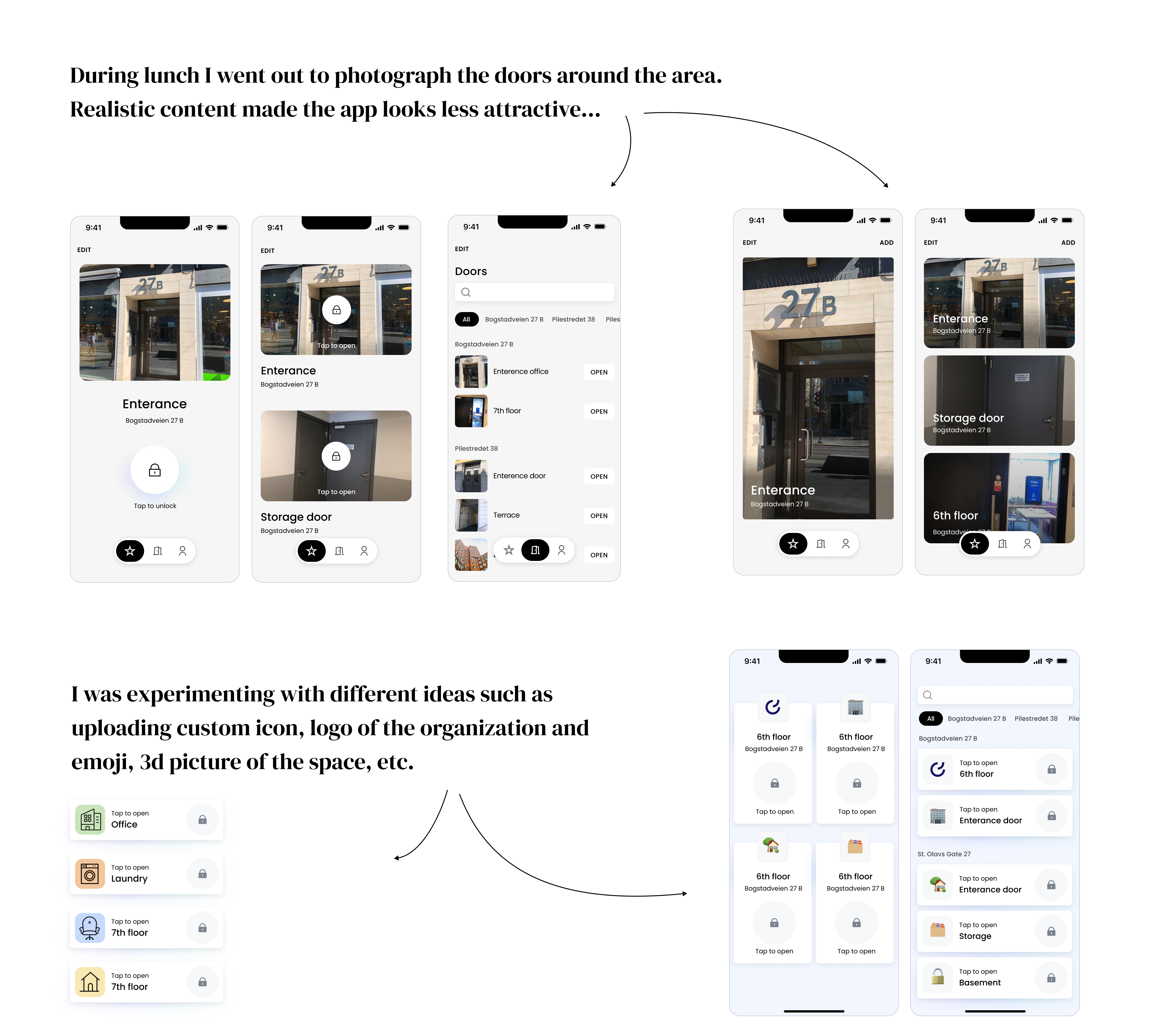
A quick visual cue
The CEO was enthusiastic about the concept of using pictures, and the team tacitly concurred. The idea was to help users identify the door quickly and understand from which door they have a call. However, I harbored reservations about its effectiveness... The clean, Scandinavian aesthetic and swift navigation seemed hardly achievable with door photos.
Given our inability to regulate picture quality, there was a risk of cluttering the app with subpar content—especially as our apps weren't designed for user-generated content...
"But this is what our users want."
This argument prompted me to spend the morning seeking a UI solution that could elegantly incorporate photos. I explored my neighborhood's doors to present a tangible vision to the stakeholders.
“No… it is definitely not about our brand”.
The real pictures of the doors, taken in corridors on iPhone looked similar sometimes and pretty messy. I suggested testing the idea of minimalistic icons that would correspond to the door type.
Testing the idea
I created a prototype to see if people understand the new structure and the behavior of the favorites tab. I made a request to the support team to invite users to the office and show them a prototype. The result was measured with SUPR-Q quantitative analysis and the interview session was a way for qualitative insights. We’ve got approvment of our assumptions and moved forward with the concept.
THE SURVEY USERS FILLED IN AFTER PARTICIPATING THE INTERVIEW
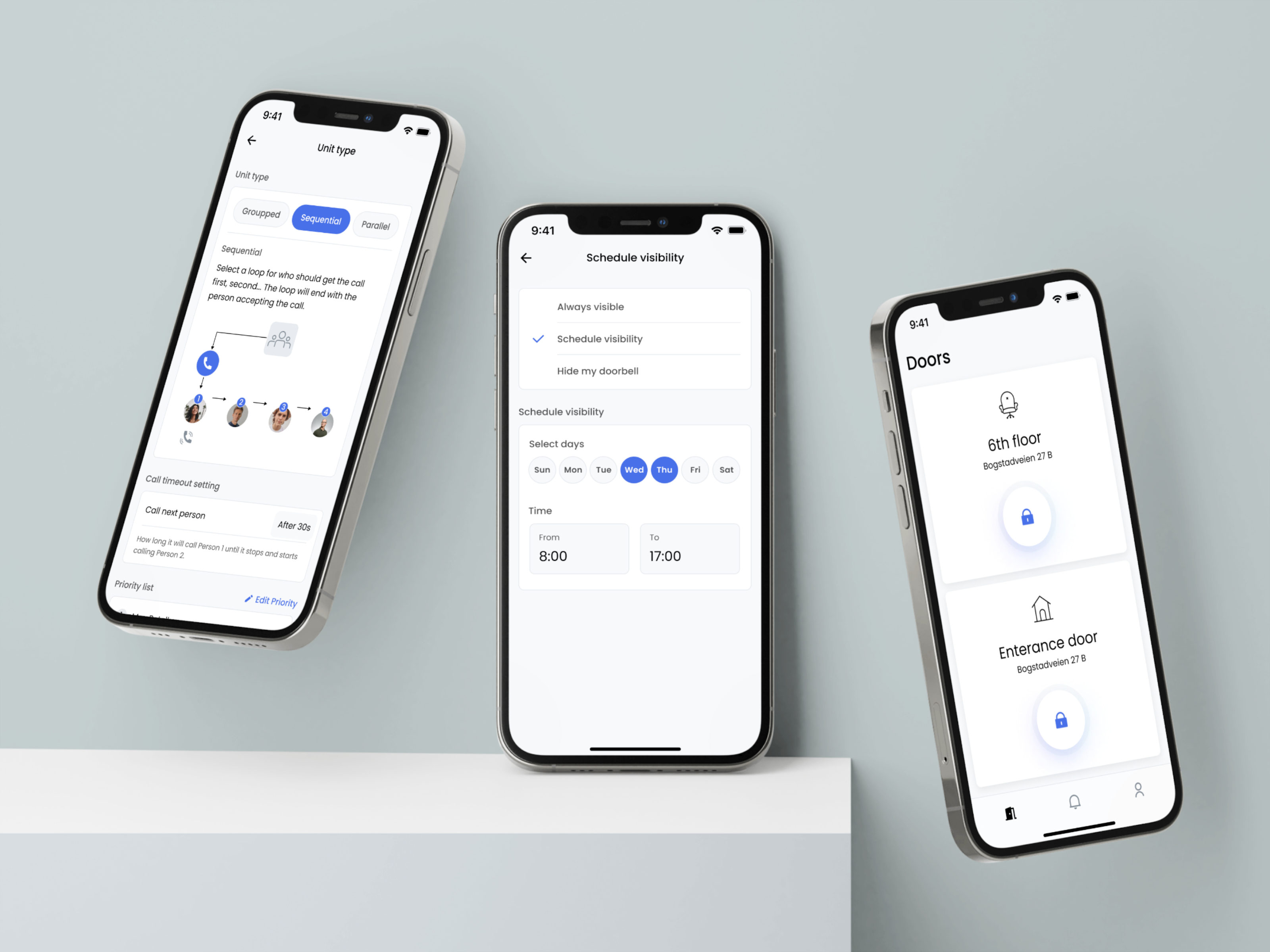
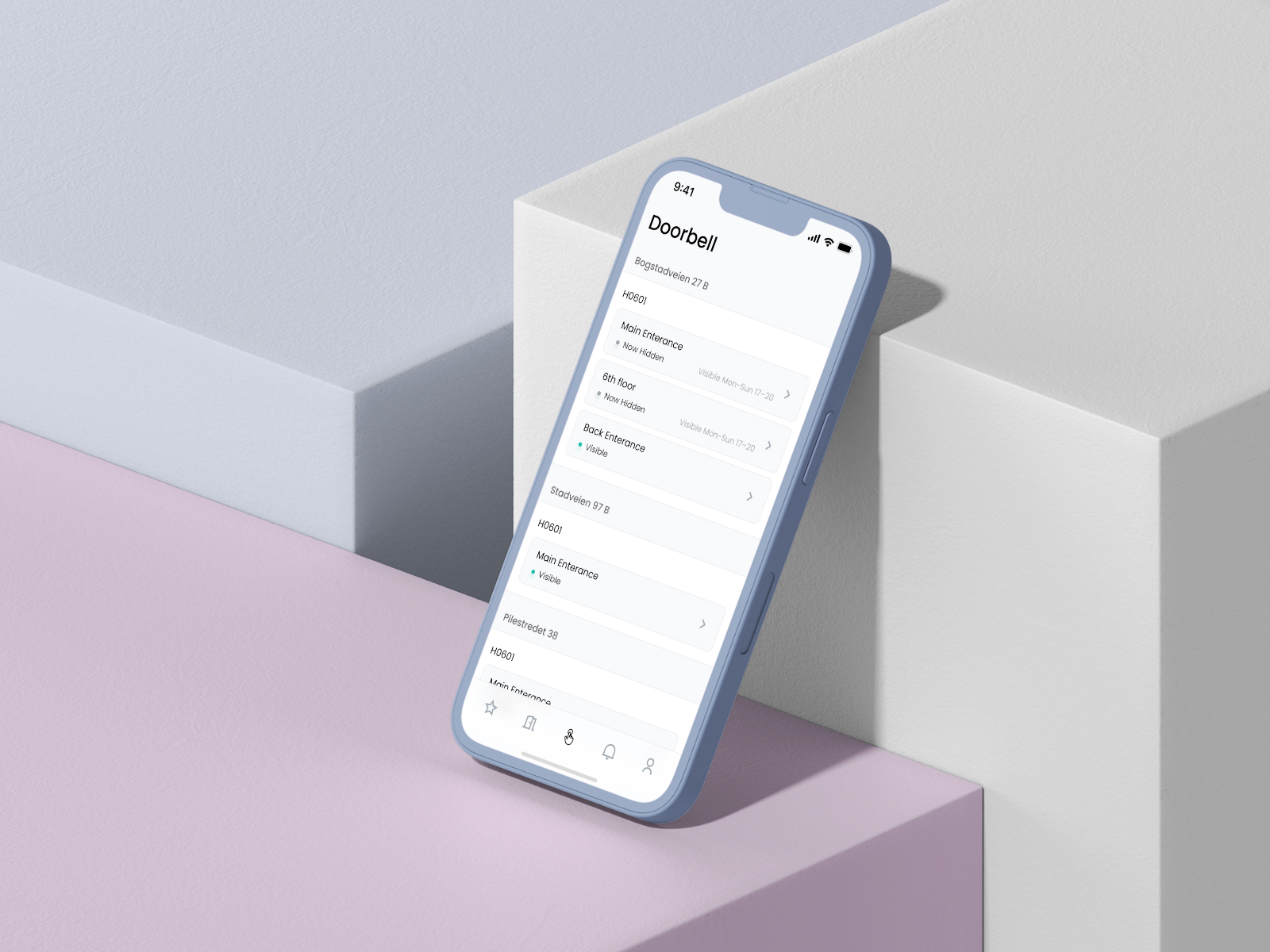
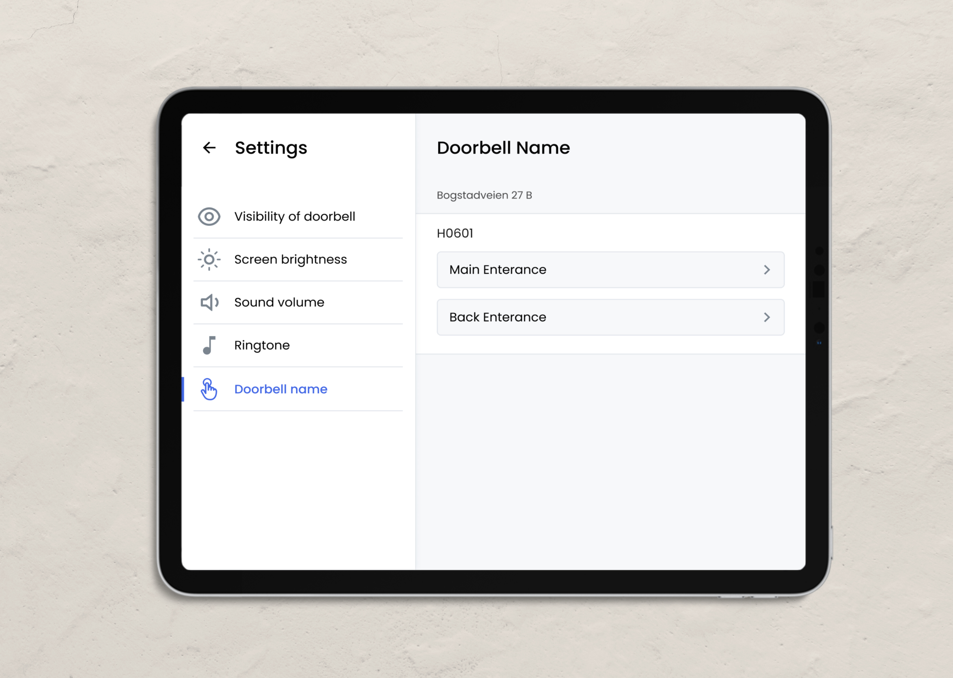
Change the visibility settings
The problem:
By mistake users changed the visibility of the door. There was no surprise for me, it was not a common feature but it was placed on the main screen as a small icon.
Old app screen with little eye next to the name
Moreover, users were struggling to comprehend how to adjust the extended visibility settings for their doors, often resorting to contacting support. They expressed difficulty in locating this particular feature.
To grasp the working of this concept better and ensure its alignment with users' mental models, I initiated a conversation with the support lead, Charlotte.
New flow. The doorbell visibility and all settings related to doorbell now on the same screen
Before, visibility of the doorbell was controlled from the main screen, where people made a lot of mistakes, while extended visibility was controlled from settings. Thus, these two features I merged and presented on a separate screen that is only about the doorbell visibility settings.
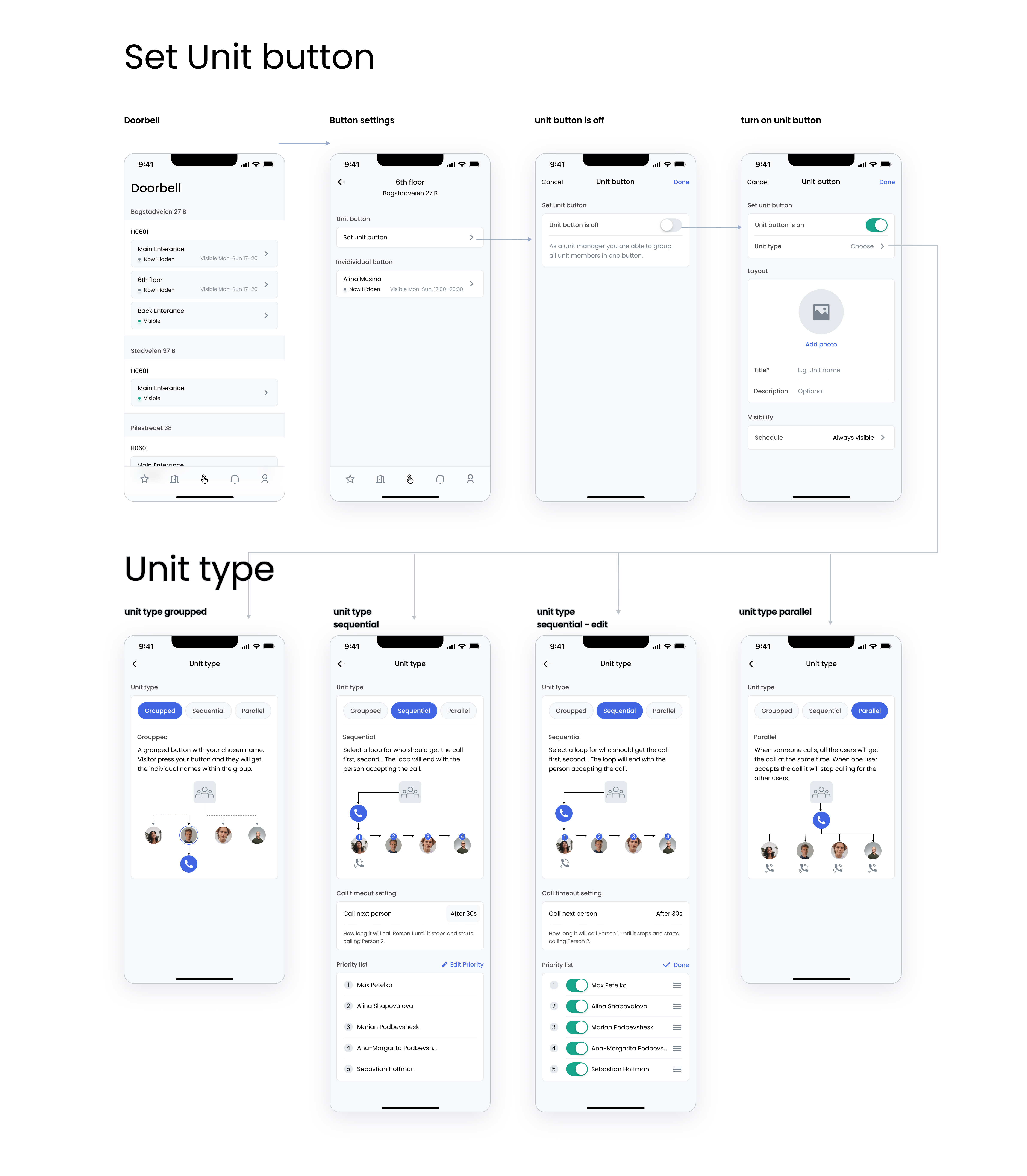
The prototype was tested with user involvement. As a result, the separate tab doorbell was created to maintain the visibility of a door, schedule visibility and set the unit icon and how all members of the unit are displayed.
I also improved the screen with call settings in unit type. It was not obvious, thus, I decided to visualize the settings, to make it obvious how it will work.
Eye adaptation in dark environment
Given the app's usage in dimly lit settings, we introduced and tested a dark mode under similar conditions. To ensure that the screen light from the selected colors wasn't harsh or intrusive, we conducted these tests at night.
We ended up with minimalistic design and improved usability of the app.
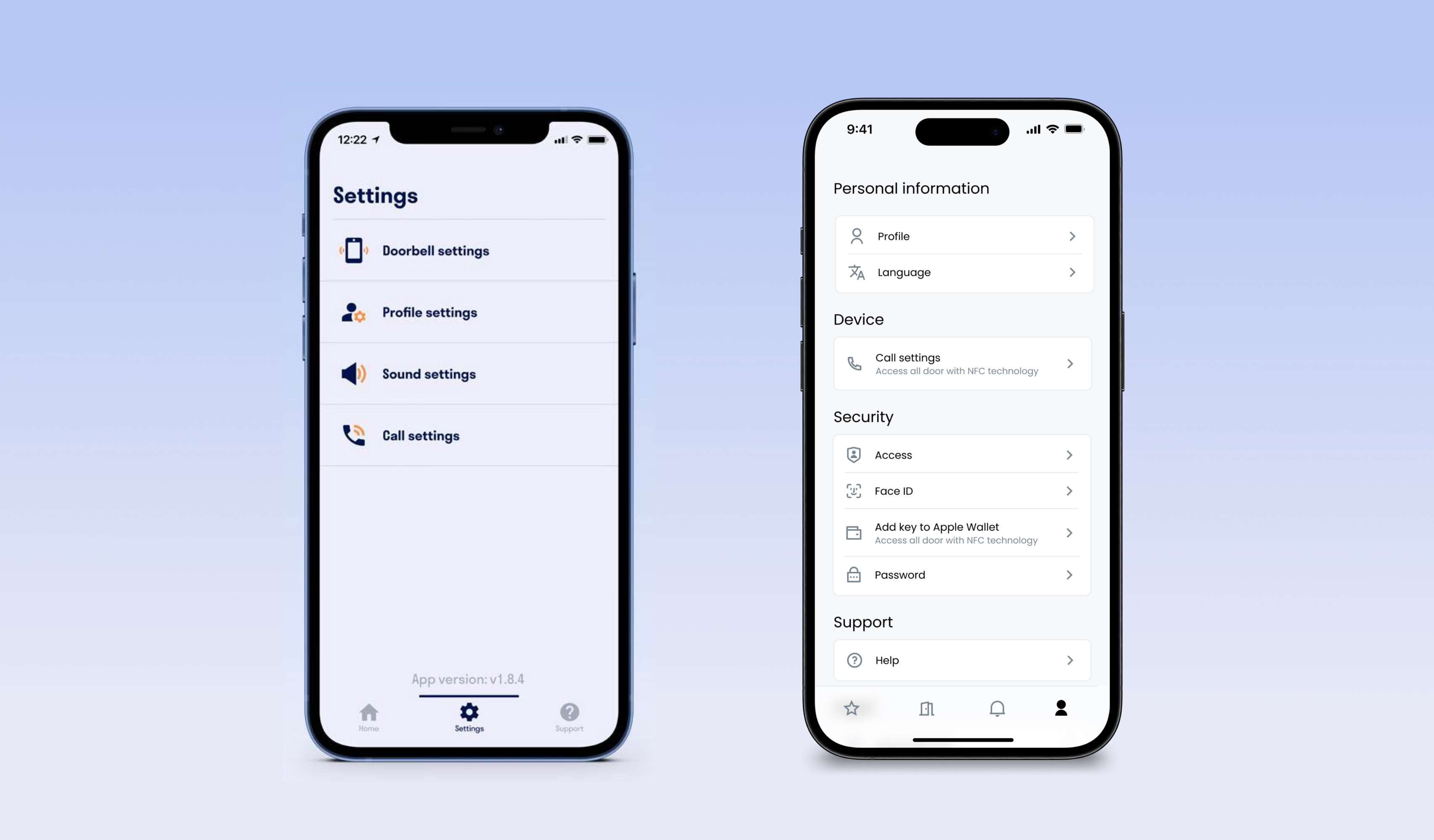
Settings screen before redesign (left) and after (right)
Outcome
1. Knowing the context is crucial to deliver user experience. The knowledge about the situation and the role are helpful for design.
2. It is always good to talk to support and know about the requests people have.
3. One more time I saw the importance of explaining the coincidence of chosen solutions in the future before developing. Providing evidence of the horrible future look of the app can save stakeholders from the decision they may regret later.
4. By comprehending the budget and existing development capabilities, we can tailor the design solution to fit the current circumstances.
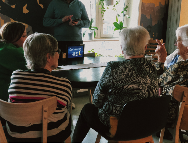
Intercom for aging people in nursing home
Separate project was dedicated to elderly group of users for nursing homes. My role was to create an interface that would be dedicated for a particular user group - elderly people.
In a collaborative initiative, Defigo teamed up with Oslo Municipality and OsloMet University to adapt their modern interface for an older user group with cognitive or physical impairments. The project involved interface testing in a Norwegian nursing home, adhering to all accessibility standards, and designing a simplified, cartoonish interface to suit the users' comprehension levels.
Challenges
The main challenge was that elderly used to work with analog devices, which was way different from the behavior of digital screens. This behavior can be obvious for digital natives or people who used technologies a lot before dementia.
Some elderly people had issues with short memory, thus instructions regarding technologies giving by nurses were not remembered
In addition, elderly from nursing home had other issues related to aging process such as coordination problems, poor visibility and readability
cognitive declines, such as a slower speed of comprehension, impact their ability to understand and navigate digital platforms
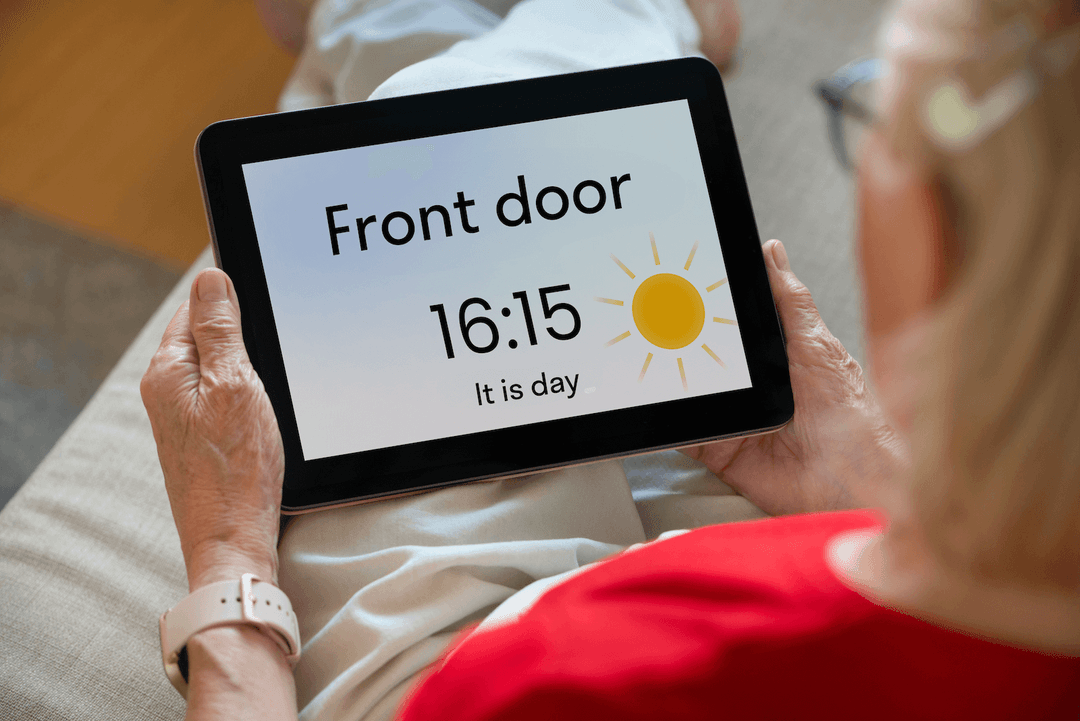
In the North, the daytime can look like night, while the night can look like daylight. Some people in nursing homes do not understand what is the day of the week and time while they wake up.
Observation and user testing
The prototype was tested with elderly people during the session, and feedback was gathered.
Solution
This is an advanced version. All these settings are not available for some users and controlled by admin
1. Limited features that are controlled by admit (in order not to overload people with impairments with complicated settings, since by mistake they can turn off the sound etc.)
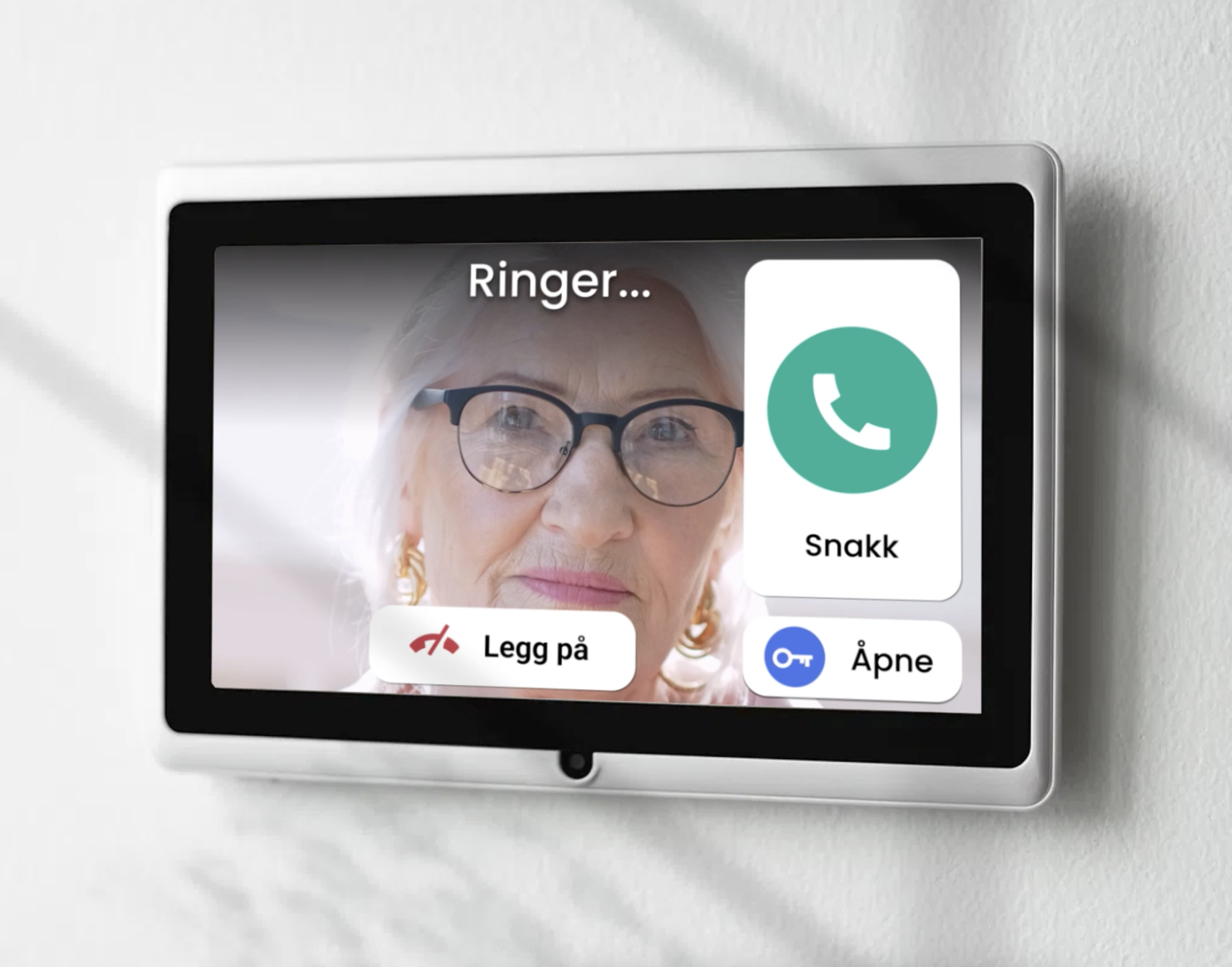
2. The intercom (answering device) always displays a static screen with a simple illustration of daytime, date and time (except when a visitor is calling).
3. Large, easily visible buttons and straightforward instructions guide the resident on when they can converse with visitors and tap the button to unlock the door.
4. Explanatory icons
Outcome
Context is a king
Designing interfaces for the elderly population is not just about adhering to rules and standards specific to this user group. It's equally crucial to understand the context in which these designs will be used. Through tests, prototypes, observations, and collaborations with scientists studying nursing homes, we've been able to design niche product tailored to meet specific demands.
It may take more effort to develop simple interface
Interestingly, I found that it sometimes takes more effort to develop simple interfaces than it does to create multi-platform products. This is because simplicity often requires a deep understanding of the user's needs and a careful elimination of unnecessary elements, which can be a complex process.
No items found.
No items found.
Thank you!
Defigo and Lanars team for trust and collaboration.